

Seedream Product Photography: Preserve Labels, Logos & Shape
Use Seedream product photo prompts for catalog, lifestyle and ad images. Learn how to protect labels, logos, shape and color, and when to keep the original.
A product photo can look convincing while showing the wrong product. A bottle becomes slightly taller. A cap loses its ridges. The label looks readable until you enlarge it and find a different word.
For Seedream product photography, start with a clear photograph of the actual item, describe the background change, and name the details that must stay the same. Then compare the downloaded result with that photograph. A preservation instruction is useful guidance; the comparison decides whether the image is usable.
This guide covers three briefs for the same product: a catalog image, a lifestyle scene and an advertising layout with room for copy. The prompts are untested templates, not reported Seedream 5.5 Pro results. The accompanying images illustrate photography and review concepts; they are not outputs from these prompts or tests performed on this website.
Start with a photograph you can check against
Choose one image as your master reference. Keep its original file, rather than replacing it with an edited export. You will return to it for every variation.
The entire product should be visible, including its base, cap, handle and any parts included in the sale. Use a simple background and a view that already shows the label you want customers to see. If you need the back panel, photograph the back panel. Asking a model to rotate a bottle cannot supply reliable evidence of text hidden from the camera.
Before uploading, enlarge the photograph and check these details:
- The smallest important text is legible, not just the brand name.
- Reflections do not cover the logo, quantity or product variant.
- The outline is sharp, with space around the whole object.
- Color looks faithful to the item under neutral lighting.
- Accessories are visible and easy to count.
For shiny packaging, change the light or camera position until glare moves away from the label. For soft goods, arrange the item so that folds do not hide identifying seams or patterns. Avoid asking AI to reconstruct a detail that a better reference photograph could capture directly.
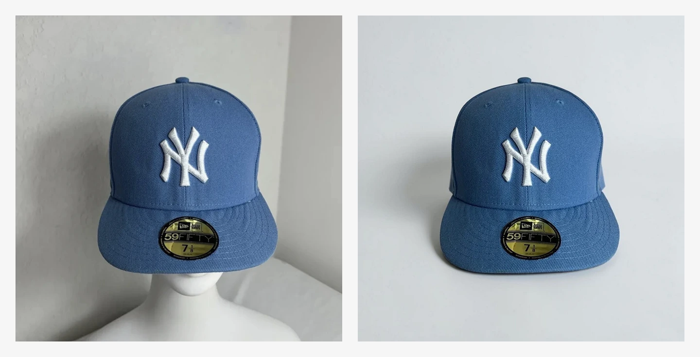
A useful comparison includes several independent checks. Here, the embroidered mark, brim sticker and crown shape all deserve attention; checking only the blue color would miss most of the product's identity.
Write down what must remain unchanged
“Keep the product the same” leaves too much implicit. Make a short identity list for your item before writing the scene description.
| Detail | What to specify | What to inspect afterward |
|---|---|---|
| Logo | Position, orientation and appearance | Letter shapes, spacing and missing marks |
| Label | Exact visible wording and layout | Spelling, numbers, line breaks and symbols |
| Proportions | Body width, height and cap-to-body ratio | A taller bottle, narrower jar or enlarged handle |
| Color and material | Actual color, transparency and finish | Tint shifts, glass becoming opaque or matte becoming glossy |
| Structure | Cap, pump, seams, handle, ports or closures | Missing parts, extra openings or altered connections |
| Included items | Product and accessory count | Duplicated pieces or props that resemble bundled accessories |
Use wording that describes your actual reference. Do not paste a bottle prompt onto a jar and expect the model to resolve the contradiction.
ByteDance's Seedream 5.5 overview presents targeted editing and preservation of unedited regions as model capabilities. That is a reason to explore reference editing, not proof that a particular output preserves every character or measurement. A prompt also does not lock the product layer the way a conventional image editor can.
For a label with essential small text, the dependable fallback is to retain the photographed product and edit the surrounding composition separately.
Choose the correct tool before using the prompts
Seedream 5.5 Pro is the name of this website. It does not identify the model used by every tool on the site.
To try the Seedream product photo prompts below, open the Seedream 5.5 generator and editor, confirm that Seedream 5.5 is selected, and upload your reference for Image to Image editing. Use the prompt field for the full brief. The current configuration offers 1:1, 3:4 and 16:9 among its aspect ratios; choose the ratio for the intended placement before generating.
The separate AI Product Photography tool provides a simpler preset workflow: one reference photo, Studio or Lifestyle scenes, lighting choices and framing. Its current implementation selects MiniMax H3 Image Edit, not Seedream 5.5. The presets request preservation of the viewing angle, packaging, label and visible parts, but they do not guarantee an unchanged product. Use this route for preset compositions; use the Seedream editor for the custom prompts in this guide.
These distinctions reflect the site's configuration reviewed on November 16, 2026. No generation run was performed for this article. Confirm the selected model and available settings when you create your own images.
Three Seedream product photo prompts for one item
The following templates use a hypothetical amber bottle with a black screw cap and a cream label. Replace that description with your own product details. Keep the same master photograph for all three attempts, rather than feeding the first generated result into the next one.
Use one output per attempt and keep the resolution and output format consistent while comparing compositions. For example, start at 1K with PNG selected, then inspect the downloaded file. These are suggested comparison settings, not settings from an executed test. A larger output does not prove more accurate packaging.
Catalog image: make the item easy to inspect
A catalog brief should keep the viewing angle stable and leave the outline unobstructed. Start with a square frame if your intended placement is square. Check the destination's image requirements before deciding on background color, shadows or cropping.
Edit the uploaded product photograph into a clean catalog image.
Use the uploaded amber bottle as the product reference. Preserve its
viewing angle, silhouette, height-to-width ratio, amber glass color,
black screw cap, cream label, visible logo and all visible label text.
Keep the cap attached and retain the original number of visible parts.

Change the background to a plain white studio setting with a subtle
contact shadow beneath the bottle. Use soft diffused light and keep
reflections away from the label. Center the complete bottle in a 1:1
frame with space around every edge. Do not add props, lettering,
accessories or additional products.
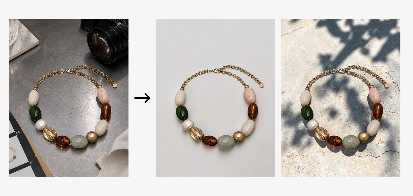
A background change gives you a new presentation. It also creates a review task: for a necklace, compare the bead sequence, chain and pendant arrangement before accepting the cleaner composition.
Lifestyle image: change the setting with restraint
Choose a setting connected to the product's real use. Keep props away from labels and leave enough of the surface visible to establish scale. A dramatic new camera angle is a separate task that benefits from a matching reference photo.
Edit the uploaded amber bottle photograph into a quiet bathroom
counter scene. Preserve the bottle's original viewing angle, shape,
proportions, amber glass color, black screw cap and cream label.
Keep the visible logo and label wording unchanged. The cap stays closed.

Place the bottle on a pale stone counter beside one folded neutral
washcloth, with the washcloth behind the bottle and not touching it.
Use indirect window light with neutral color on the product and a
believable contact shadow. Keep the whole bottle and label unobstructed
in a 3:4 frame. Do not add other bottles, ingredients, packaging,
lettering or accessories.
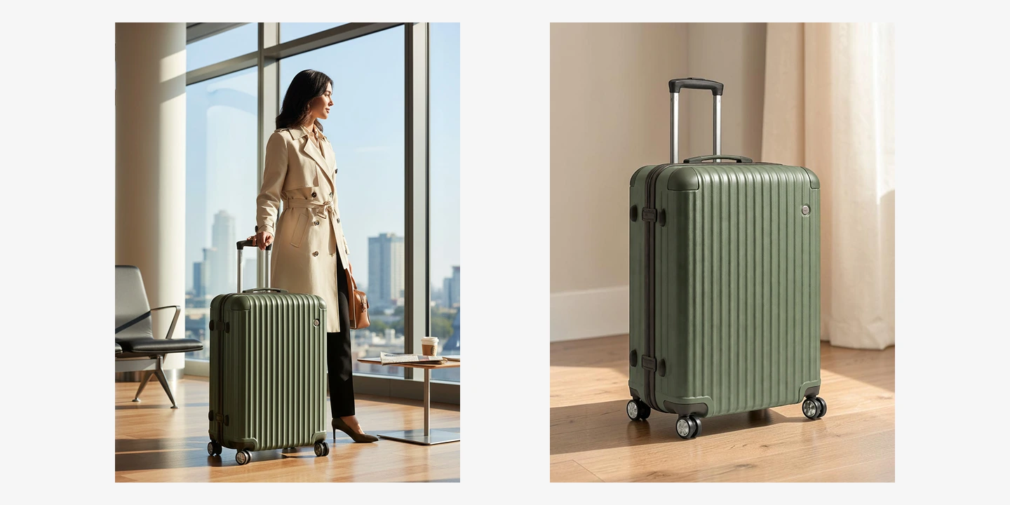
Context can communicate use, but it introduces new ways to change the product. In a scene like this, check the suitcase's handle, wheels and shell pattern as closely as the setting. An attractive environment does not establish accurate scale.
Advertising image: leave room for finished copy
For an ad, generate the composition with a quiet area for your headline. Add final campaign text afterward in a layout editor, where you can control wording and typography directly.
Create a 16:9 advertising background around the uploaded amber bottle.
Preserve the bottle's viewing angle, proportions, amber glass color,
black screw cap, cream label, visible logo and all visible label text.
Keep the entire bottle visible, with no changes to its parts.

Position the bottle in the right third on a warm off-white surface.
Leave the left half simple, low contrast and free of objects for a
headline to be added later. Use soft directional lighting, a subtle
contact shadow and restrained highlights that do not obscure the label.
Add no headline, price, slogan, extra branding, props or duplicate bottle.
Preview the intended headline over the downloaded image before approving it. Empty space can still be unusable if a bright highlight or busy shadow competes with the text. Check the mobile crop separately so that neither the product nor the headline area disappears.
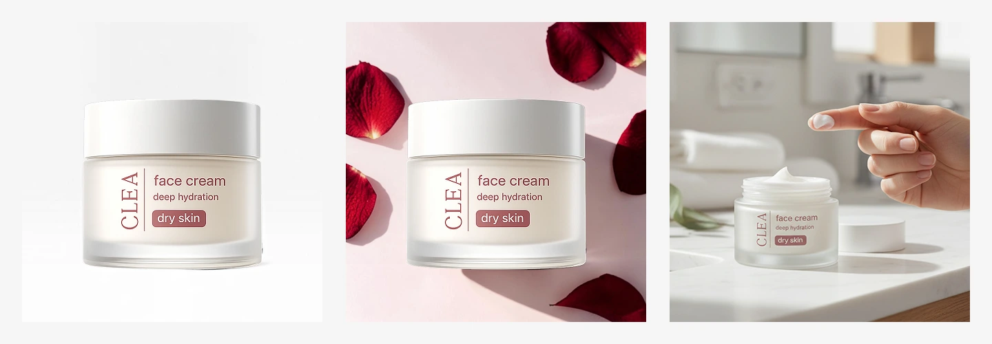
These three compositions illustrate different image roles, not the results of the bottle templates. Notice that the use scene removes the lid and introduces a hand: those changes require additional evidence about the real product and should not be treated as a simple background replacement.
Compare the result at full size
Download the result and open it beside the master photograph. Match the displayed product size in both images; otherwise a larger preview can make an altered object look deceptively similar.
Read the label character by character. Check the brand, product variant, quantity and any visible small print. Text that has become plausible-looking decoration is a failed preservation check, even if the headline logo looks correct. OCR can help flag a discrepancy, but it does not replace visual review.
Then compare the silhouette. For the bottle template, inspect shoulder curvature, body width, cap height and the bottom edge. A basic overlay in an image editor can help: align the two products, reduce the top layer's opacity and look for displaced edges. Account for any intentional scale or position change before judging the outline.
Finally, review material and assembly. Check that transparent glass has not become solid, the label has not wrapped differently, the cap remains connected and no accessory has appeared. Compare color on the same display. An orange background or warm light can make an amber bottle look richer while also making its color less faithful.
| If you find this problem | Try this next |
|---|---|
| Label wording has changed | Return to the master reference; if exact text is essential, retain the original photographed product |
| Body or cap shape has drifted | Remove viewpoint changes and simplify the scene; compare a fresh result with the master |
| Props hide the label | Reduce the prop count and specify their position behind or away from the product |
| Color or finish is different | Request neutral lighting on the product and reduce colored reflections |
| A hand, lid or accessory is invented | Supply an actual reference for that arrangement, or keep the original configuration |
Do not carry a faulty label into another generation and hope it will become accurate. Return to the master image. Once a composition passes, keep the input filename, prompt, selected model, aspect ratio, resolution, format, output file and review notes together. That record lets you repeat a brief without calling an unrecorded result a model test.
When to keep the original product photograph
Keep the original for images whose purpose is exact evidence: ingredient panels, specifications, serial numbers, fine engraving, small packaging text and product-condition close-ups. The same applies when a seam, connector or finish determines which variant a customer receives.
You can still create a new background independently and composite the original product onto it. Inspect the cutout edge, contact shadow and perspective, while preserving the photographed label and structure. For glass or translucent packaging, retained reflections may require careful manual compositing or a new photograph.
If you need to explore a composition from separate product and scene references, the AI Image Combiner is another route. Assign each input a clear role and review the result against the original product. Its current configuration also uses H3 editing models; it is not a pixel-locked compositor or evidence of a Seedream result.
A useful background is only half the job
Start with the plain catalog version and check the product before attempting a lifestyle scene or an ad. If the simplest composition changes essential details, keep the real product photograph and build the presentation around it.
The finished image should give you a new way to show the item while leaving customers with an accurate understanding of what they will receive.